A quick look at how to incorporate GEDELT visualizations or create ones using xts and dygraphs.
how-to
GDELT
wrangling
Author
Nathan Craig
Published
October 10, 2022
Modified
March 21, 2024
The Global Database of Events, Language, and Tone (GDELT) offers a TV News explorer. I’ve tinkered with using this to look at themes like Critical Race Theory and explored a bit how to access GDELT data via api. Previously, I visualized the data using ggplot2 but recently I began using the dygraphs library and thought it might be interesting to apply to GDELT data. Representing GDELT searches using dygraphs is the main thing this post looks at. First, let’s dig into simply embedding one of the graphs produced by GDELT.
Embedding
GDELT provides nice interactive visualizations and Quarto offers a simple mechanism to embed such a visualization using iframe along with fenced divs. If you just want something quick and dirty, embedding is a fine way to go. However, graph customization is very limited.
It is worth noting that GDELT TV News search interface offers two output options: Summary Overview Dashboard and Comparison Visualization.
The Summary Overview Dashboard returns individual station mentions of a single search term. It allows one to see similarities and differences between networks regarding the mention of a specific search term. The Comparison Visualization allows one to look at similarities and differences between search terms where all news networks are merged. Each tells a different story about the data. We will look at both options.
Output
Figure 1: Critical Race Theory showing coverage by station.
Figure 2: Comparison visualization showing differences and similarities in the coverage of “Critical Race Theory” and “Evolution” over time.
Note while Figure 1 and Figure 2 show generally similar trends, the two graphs are not synchronized in any way. To synchronize the two graphs, we’ll need to make our own. Before we get into that, let’s look at how to embed a visualization generated by GDELT.
How To Embed
To get the embed code click on the EXPORT hamburger menu and select “Embed This Chart”
Select the output text and paste it into a quarto document in source mode.
That text needs to be copied and formatted as two separate parts: first there is an html chunk containing a css class for .respviz and then a fenced div containing the iframe objects. In the example below, please note that the request URL was shortened for readability.
Voilà, (with a fully formed URL) this should produce an embedded graph like the ones shown at the top of this page. Now, let’s turn to how we can create our own visualizations that can be customized.
Constructing Visualizations
Making one’s own visualization of the data isn’t that much more complicated than embedding, and there is the added benefit of having access to a wider range of customizations.
Single Search
We will load the data using read_csv and then convert it to a time series for plotting.
# paste in the text from the GUI search box.# note that entire string should be contained in single quotes# this allows for double quoted search termssearch_term<-'"critical race theory"'
Code
# Paste the request URL into a read_csv call and assign to variabledf<-read_csv("https://api.gdeltproject.org/api/v2/tv/tv?format=csv×pan=FULL&last24=yes&dateres=DAY&query=%22critical%20race%20theory%22%20(station:BLOOMBERG%20OR%20station:CNBC%20OR%20station:CNN%20OR%20station:CSPAN%20OR%20station:CSPAN2%20OR%20station:CSPAN3%20OR%20station:FBC%20OR%20station:FOXNEWS%20OR%20station:MSNBC%20)%20&mode=timelinevol&timezoom=yes")%>%rename(date =1, network =2, value =3)%>%mutate(search =search_term)head(df)
date
network
value
search
2009-06-05
BLOOMBERG
0
“critical race theory”
2009-06-06
BLOOMBERG
0
“critical race theory”
2009-06-07
BLOOMBERG
0
“critical race theory”
2009-06-08
BLOOMBERG
0
“critical race theory”
2009-06-09
BLOOMBERG
0
“critical race theory”
2009-06-10
BLOOMBERG
0
“critical race theory”
Great, we have a data frame. However, dygraphs wants a time series object. Therefore, this data frame has to be converted to a time series object. Complicating matters is the fact that there are multiple series in “long” form.
In terms of figuring out how to convert a data frame with multiple series to a format that dygraphs reads, I initially found Marcelo Avila’s Stack Overflow answer was helpful; though I don’t quite use it in the end. Marcelo’s approach involves reading the data frame with zoo and then converting it to an xts with as.ts(). This worked well with the API call, but I found that doesn’t work with a csv file. With some experimentation, I found that a call to read.zoo() worked in both cases and was simpler; so that’s what I went with.
In short: we’ll pivot wider and use the as.ts function with read.zoo to create a time series data structure that dygraphs likes.
Code
df_wide<-df%>%pivot_wider(names_from ="network", values_from ="value")%>%select(-search)# we don't want this inside the time series
Code
# This is from Marcelo Avila's SO answer# We can read the data as a zoo object and convert# to an xts object. However, dygraphs can read zoo# ts <- as.ts(read.zoo(df_wide))ts1<-read.zoo(df_wide)# ts <- as.ts(df_wide)
You can use head(ts) to see the data structure. The data will plot with simply dygraph(ts) alone, but the visualization looks better with some styling. See the dygraphsreference for styling and annotation options.
Code
dygraph(ts1)|>dyRoller(rollPeriod =15)|>dyHighlight(highlightCircleSize =5, highlightSeriesBackgroundAlpha =0.2, hideOnMouseOut =TRUE)|>dyEvent("2011-09-05", "Bell Passes ", labelLoc ="top")|>dyEvent("2012-03-07", "Breitbart Publishes Obama/Bell Video ", labelLoc ="top")|>dyEvent("2020-06-25", "George Floyd Murdered", labelLoc ="bottom")|>dyEvent("2020-09-01", "C. Rufo on FOX News", labelLoc ="bottom")|>dyEvent("2020-09-22", "Trump Signs EO ", labelLoc ="top")|>dyEvent("2021-01-20", "Biden Sworn In ", labelLoc ="top")|>dyAxis("y", label ="% Airtime (15s blocks)")|>dyLegend(width =850)
Figure 3: GDELT Volume Timeline
Comparison Searches
This works very well when the GDELT search interface Output Type is set to Summary Overview Dashboard. However, when the GDELT search interface Output Type is set to Comparison Visualization, the Export -> Save as JSON option is not available. I’m not sure why this is, but if one wants to build a comparison graph, at present, it is necessary to download a csv file. We’ll do that for a search wereh output type is set to Comparison Visualization.
Read this file and convert it to a format that dygraph can read. First, we make a data frame.
I found that reading from a csv was different than reading from the API above. To convert the data frame to something dygraphs wants, I was initially using as.ts(read.zoo(df_wide)). However, when reading from csv many of the 0 readings were converted to NA. This can be overcome with z2[is.na(z2)] = 0. However, if one simply uses read.zoo() this isn’t necessary. I just used zoo which seems to work fine.
Figure 4: GDELT volume timeline comparing mentions of “Critical Race Theory” and Evolution
Descriptive Statistics
Having visualized at the data, there are some questions one might want to ask about their structure. Does one station cover “Critical Race Theory” more than another? Is “Critical Race Theory” discussed more often than Evolution?
Does one station cover CRT more often than another?
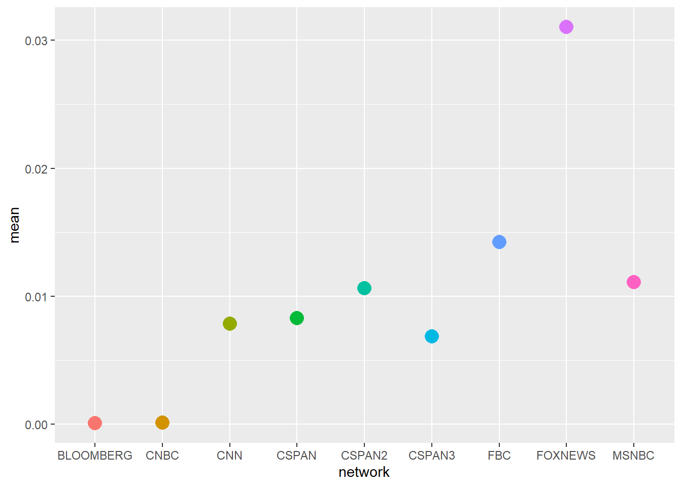
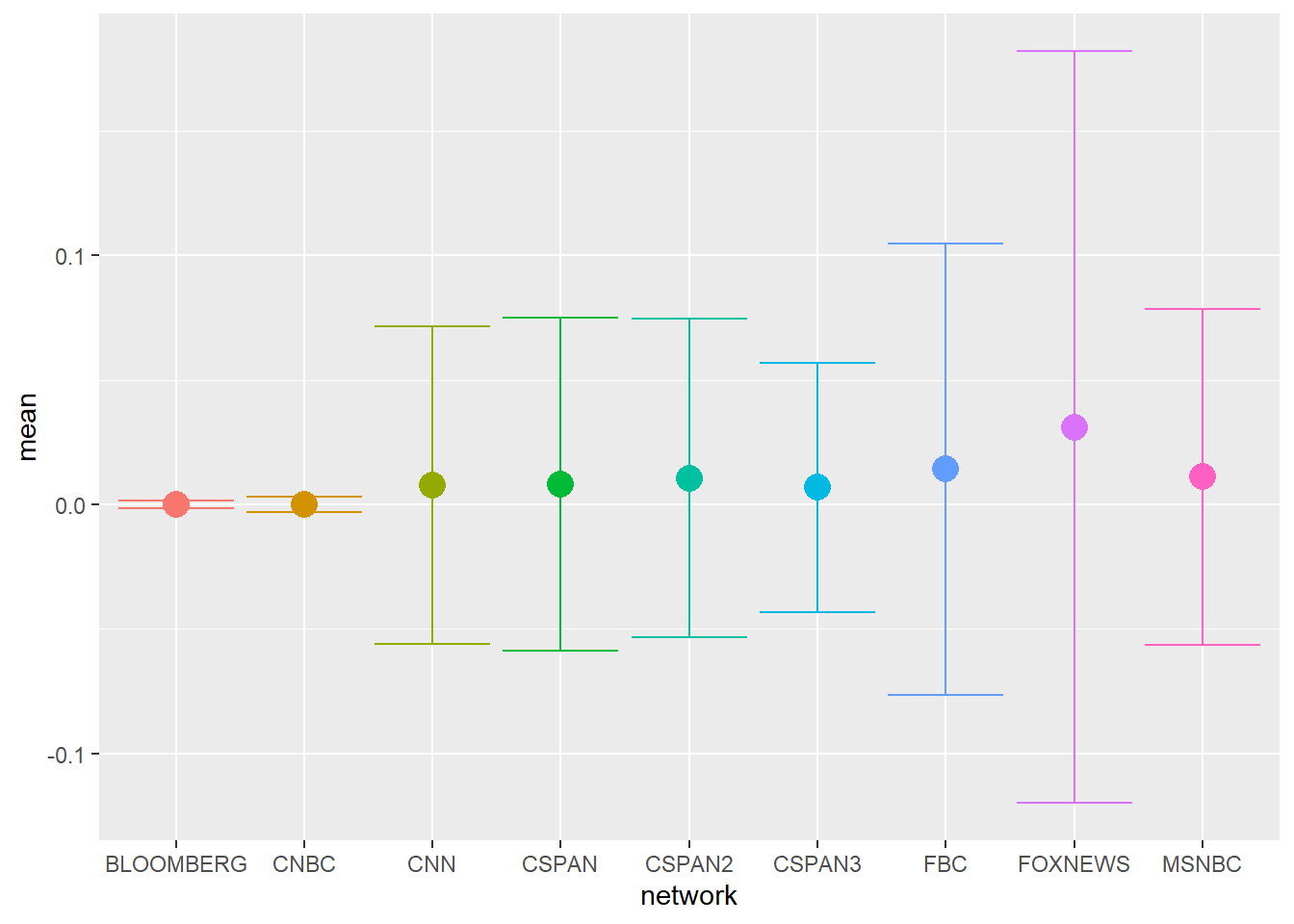
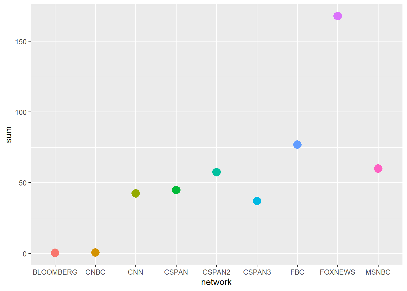
Let’s narrow the question slightly. For the period of time covered by GDELT, are there differences in the average and total coverage of CRT by network? We can begin by generating a few simple descriptive statistics and plotting these.
Code
df_crt_summary<-group_by(df, network)|>summarise( sum =sum(value), mean =mean(value), sd =sd(value))df_crt_summary|>kable(digits =3)
Table 1: Summary statistics of CRT coverage by network
Based on the average and sum plots, it looks like FOXNEWS reported more frequently on CRT than other networks. The average plot is complicated to read because while FOXNEWS has the hugest average coverage (Figure 5 (a)) when one includes standard deviation the differences are less clear (Figure 5 (b)). This is because of the very large variation in FOXNEWS coverage. Differences in coverage appear clearer when looking at total coverage; here we can see that FOXNEWS covered CRT more than twice as often as any other network (Figure 5 (c)). Intriguingly FBC, which is Fox Business, has the second highest average and second highest total coverage of CRT.
Is Critical Race Theory covered more often than Evolution?
Looking at Figure 4, it seems as though there are differences in the coverage of CRT and Evolution over time. Generally, Evolution is mentioned more frequently but in 2021 there was a marked increase in mentions of CRT. We can quantify the global differences Table 2.
Table 2: Summary statistics comparing mentions of CRT and Evolution in the GDELT TV News Archive.
search
sum_norm
mean
sd
Critical Race Theory
0.053
0.016
0.062
Evolution
0.093
0.028
0.016
Both the time normalized sum and mean coverage of Evolution is higher than CRT, but the standard deviation of CRT coverage is much higher than Evolution. This is because of the very high amplitude coverage that occurred in 2021 and continues to early 2022.
Code
# Pre-2021 Coveragedf2|>filter(date<"2021-01-01")|>pivot_longer(2:3, names_to ="search", values_to ="value")|>group_by(search)|>summarize(# Sum is temporally scaled sum_norm =(sum(value)/as.numeric(difftime("2021-01-01", min(df2$date), units="days")))*100, mean =mean(value), sd =sd(value))|>kable(digits =4)
Code
# Post-2021 Coveragedf2|>filter(date>"2021-01-01")|>pivot_longer(2:3, names_to ="search", values_to ="value")|>group_by(search)|>summarize(# Sum is temporally scaled sum_norm =(sum(value)/as.numeric(difftime(max(df2$date),"2021-01-01", units="days")))*100, mean =mean(value), sd =sd(value))|>kable(digits =4)
Time series analysis (Kitagawa 2020), and time series forecasting (Hyndman and Athanasopoulos 2021) are enormous fields that I barely understand. However, I do know that when the pre-event state is low amplitude and low variability for long periods of time, then for the purpose of event analysis the mean and standard deviation of that signal can serve as a predicted counterfactual (Huntington-Klein 2022). Therefore, we should be able to compare the before state to the after state based on mean and standard deviation.
This is useful, but in this case the standard deviation is larger than the mean. This is because the signal is larger but still erratic over time. To talk about accumulated coverage over time, we can use a time normalized sum.
Hyndman, Rob J., and George Athanasopoulos. 2021. Forecasting: Principles and Practice (3rd Ed). Melbourne, Australia: OTexts. https://otexts.com/fpp3/index.html.
Kitagawa, Genshiro. 2020. Introduction to Time Series Modeling with Applications in r. 2nd edition. Boca Raton: CRC Press.
Citation
BibTeX citation:
@online{craig2022,
  author = {Craig, Nathan},
  title = {Reading and {Visualizing} {GDELT} {Data}},
  date = {2022-10-10},
  url = {https://ncraig.netlify.app/posts/2022-10-10-gdelt-visualizations/index.html},
  langid = {en}
}